
- Level: For advanced
- Reading duration: 10 minutes
What to expect in this article
How to fire up Simulation mode
- Go to your My account on justETF.com
- Choose My portfolios from the drop-down menu
- Hit the orange Create New Portfolio button
- Select Create from scratch
- Choose your ETFs from the Search and add ETF bar (search by name or ticker).
- Alternatively, Advanced Search will whisk you to our ETF Screener and then the whole ETF universe is your oyster
60/40 portfolio test: 10.000€ turns into 28.050€
Our 60/40 portfolio consists of:- 60% MSCI World equities
- 40% Euro Government bonds (choose medium-dated)

Portfolio Money market
- The blue line shows that the 60/40 turned 10,000€ turned into 28,050€ over 17 years. That’s a 180.5% cumulative return, or 6.15% annualised.
- The green line reveals what would have happened if you’d stayed in cash (as represented by a money market ETF.)
justETF tip:
The two 60/40 appropriate ETFs with the longest track records are:
Other ETFs that cover these asset classes should behave similarly. You can analyse rival ETFs by using the Compare feature from the ETF Screener.The two 60/40 appropriate ETFs with the longest track records are:
How did the equity and bond allocations perform?
We can see how much return each of our ETFs contributed by selecting All instruments in Chart options, then moving to the Bar chart with returns tab.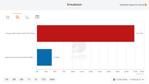
Equities Bonds
As expected, our equities did the bulk of the work but the government bonds still earned four times the amount offered by cash (41.8% versus 10.3% cumulative).
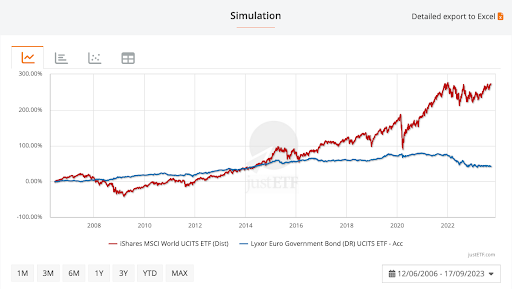
Why don’t we just choose 100% equities (red line) if they beat bonds (blue line) so handsomely? Because equities are a wild ride…
Equities Bonds
Notice how the portfolio was barely a year old when the Global Financial Crisis (GFC) began in October 2007.
The red line shows that our equities ETF was down -51.6% at the height of the crisis in March 2009. That’s tough to take.
Meanwhile, the blue bond line was trending upwards. Euro government bond prices were rising as equities fell – exactly as we hope they will.
That ‘flight-to-quality’ dynamic is why we hold government bonds – because they can counteract stock market slumps.
In this case, the 40% bond holding reduced portfolio losses to -26.8% at the worst point of the GFC crash. That’s not fun but it’s much better than a -51.6% loss.
Bonds worked during most of the subsequent market drops on our timeline, too – including the Covid crash. However, nominal bonds don’t help during inflationary surges which is why they suffered in tandem with equities in 2022.
This post will help you think through your inflation-hedging options.
Risky business
The Risk cloud tab helps you decide whether an asset is pulling its weight. The circles show you how much risk (or volatility) each ETF adds to your portfolio.
The golden rule is that there’s no reward without risk.
The reason equities deliver high returns over the long-run is because you’ll likely experience periods when their value drops off a cliff.
Stick with equities for long enough and you should earn the reward. But even paper losses can be difficult to handle, so it’s important to ensure you don’t take on more risk than you can bear.
The risk cloud chart above helps us see that government bonds reduce portfolio risk without impacting returns too much.
justETF tip: Risk refers to the volatility of an asset. Volatility measures how widely an ETF’s returns deviate from its historical average. High volatility / risk means that an ETF’s returns swing wildly from high to low. The highs feel great. The lows can be difficult while they last. It’s because undiluted risk is difficult to handle that few people should be 100% equities.
- The red disc of the MSCI World ETF hangs high to the right. This ETF delivered a high return (7.9% annualised) over the period but was also volatile (17% risk).
- Meanwhile, Euro government bonds sit towards the bottom-left because they offered less return (2% annualised) but those returns were quite stable (only 4.6% risk).
- The middle circle reveals overall portfolio performance.
Risk-adjusted return metrics
 An ETF’s Return per Risk score (right-hand column in the pic) is a ratio that tells you how much return you earned in exchange for the risk you had to bear.
Higher scores are better.
Return per risk (or risk-adjusted return) matters because there’s no point buying an asset if its volatility makes you panic. You won’t be able to hold it for long enough to earn the reward.
Think of the world’s scariest rollercoaster. It’s not worth the entry fee if it makes you feel sick along the way.
In the table above, we can see that the Return per Risk was reasonably good for both equities (0.46) and bonds (0.44).
But the portfolio’s Return per Risk score was better still at 0.58. In other words, holding 60% World equities and 40% government bonds offered a much stronger risk-to-reward ratio than either asset managed alone.
Translation: your gain came with less pain.
That’s because the bond allocation often rose when equities fell (and vice versa). As such, the 60/40 portfolio’s volatility fell proportionally more than returns – versus a 100% MSCI World portfolio.
This is a good deal and helps explain why “diversification is the only free lunch” in investing.
Risk-adjusted return is a subtler measure than straight performance but it’s a more realistic one.
It helps illustrate that investing is risky, and rightfully steers us away from simply choosing the highest performing ETFs, and towards a better diversified blend of complementary asset classes.
OK, now we’ve seen how the tools work, let’s experiment with taking more equity risk – but from within Simulation mode’s safe space!
Next, we’ll try an 80/20 portfolio. How did this asset allocation fare from 2006 to 2023?
80/20 portfolio test: 10.000€ turns into 32.673€
Perhaps we’re in our early twenties or highly risk tolerant, either way we feel we can deal with up to 80% of our portfolio in World equities. What does Simulation mode tell us about how that worked out?
Portfolio Money Market
For a proper comparison with the 60/40 portfolio, we use the same ETFs and dates for the 80/20 historical simulation.
And from the chart, you’d be hard-pressed to tell the difference from the 60/40 portfolio’s results – except that the 80/20’s cumulative returns have soared over 200%.
Let’s zoom in:
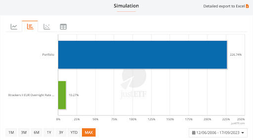
Portfolio Money Market
The bar chart tells us the 80/20 portfolio gained 226.7% over 17 years. Our initial 10,000€ investment was transformed into 32,673€. That’s 16% higher than the 60/40’s return.
Now let’s check the portfolio’s annualised and risk-adjusted return:
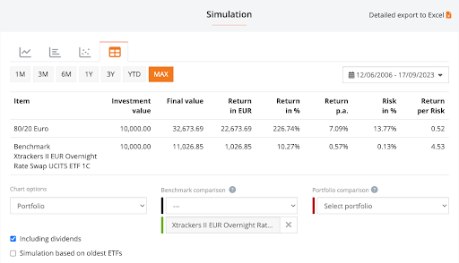 The portfolio scored a 7.1% annualised return versus the 60/40’s 6.15% result.
However, risk climbed substantially too. Ultimately, the 80/20’s Return per Risk score is 0.52 – worse than the 60/40’s 0.58.
So yes, the 80/20 portfolio earned more money, but it was a rougher ride, too. Only you can decide whether you’re happy taking the extra risk.
How did the 80/20 perform during the Global Financial Crisis?
Simulation mode lets you customise your dates to review how any portfolio performed at critical moments in the timeline. The GFC is one such event because it’s a huge stock market crash that bears out the wisdom of diversifying into less risky asset classes.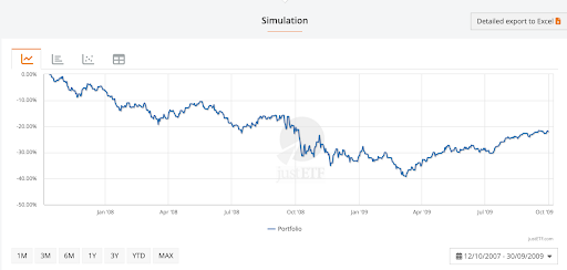
Portfolio
The chart shows that the 80/20 portfolio was down 39% when the market hit rock bottom.
We’ve already seen that 100% World equities fell to -51% at this point, while the 60/40 portfolio’s bonds held it to a -26% loss.
It’s hard to turn those numbers into emotions but try to visualise how you’d feel if your existing investments dropped by those amounts.
If -26% sounds OK but -40% too much then don’t risk an 80/20 portfolio.
The best advice, if you’re just starting out, is to invest cautiously to begin with. Stick to the 60/40 baseline and see how you react as your portfolio is jolted by the market.
As you gain experience, you’ll get a feel for how much risk you can take. But you’ll only truly know during a big crash. This is why it’s wise not to push your risk levels too far until you’ve experienced some serious market turbulence.
Just add gold
OK, gold is a popular diversifier and the Portfolio Builder shows why: This time we swap out 20% bonds for 20% gold. That creates a 60/20/20 equity/bond/gold portfolio.
We can see immediately from the chart above that gold’s returns are almost as high as the MSCI World’s from 2006-2023.
Essentially, gold went on a massive tear during the GFC up to 2013. Then it hit a rough spell for six years before recovering again during the pandemic.
Notice how gold’s behaviour is quite unlike equities or bonds, though. It often rises and falls at different times from the two main asset classes – which makes the yellow metal a good choice for additional portfolio diversification.
Here’s gold’s cumulative return during the period:

Equities Portfolio Gold
Gold delivered a 7.52% annualised return for 17% risk.
It’s every bit as risky as equities but its tendency to perform under different circumstances is what makes it a useful portfolio diversifier.
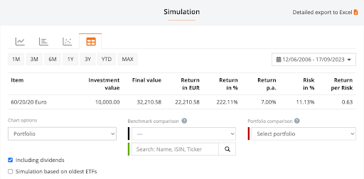
60/20/20 portfolio test: 10.000€ turns into 32.210€
Equities Portfolio Gold
Our golden portfolio generated almost as much wealth as the 80/20 but has a much better Return per Risk score: 0.63 (versus 0.52 for the 80/20).
Hence the 60/20/20 portfolio’s journey was much smoother and we only gave up 460€ over 17 years.
OK, but what happened during the GFC?
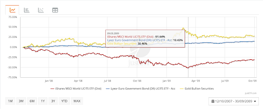
Equities Portfolio Gold
The portfolio was down -21% which is the best performance yet. Essentially because gold was one of the outstanding performers during the crisis.


